PBR - Shooting and Calibrating Basecolor Textures
- Preface
- Recap
- Shooting cross-polarized images
- Linearizing a photo & black point shenanigans
- Making a linear profile for Lightroom
- Using RawTherapee for linearization
- Can you trust Color Checkers?
- Finding a low-cost exposure calibration target
- Setting the exposure and white balance
- The proof is in the pudding. Providing evidence.
- Conclusion
Preface
https://xkcd.com/2797/ (CC BY-NC 2.5)
This blog post is about trying to bring a bit more light into a topic that is often quite misunderstood. It is, however, by no means a be-all and end-all guide for PBR Albedo calibration. I am still just a 3D artist, not a material or color scientist and I'm definitely not qualified to make any general statements about how things "really" are meant to be done. This is an overview of the research I have done over the last couple of months and is meant to be a start for a discussion and hopefully, a way for me to get some feedback. As you will see shortly, things get complicated quickly and there aren't always clear answers to all of the open questions.
If you want to compare the diffuse albedo levels from any of the images I use in this article, be sure to make them linear again first. These are almost all sRGB gamma 2.2 images for easier viewing, so color-picking from that won't really do any good.
Recap
If you haven't read my last blog post about how all of this started I recommend going there first: PBR - From Rules to Measurements. It's not entirely up to date, but it will do a better job at giving an overview of the underlaying issue and how I got here.
To quickly recap:
- PBR validators like in Substance products tell us that there are basically no natural materials that reflect less than 4% of the incoming light (with charcoal being the primary example)
- Several other blogs and Albedo chart sources state similar values
- The PBR validator thus expects you to adjust your Basecolor (diffuse albedo) to a minimum brightness of sRGB 50, 50, 50 or 30, 30, 30 - if you want to be naughty.
Albedo values, or reflectance spectra, are almost always given as the total amount of light reflected by a material, and that includes both diffuse AND specular reflection. This is crucial. The PBR validators do not take specular reflection into account when they tell you to put in those high values into the entirely diffuse Basecolor channel. This is problematic, less for very bright colors where the specular reflection has less relative impact on the look, but very much so for dark ones where specular reflection makes up almost all of the reflected light. For example, the often-stated charcoal, with its 4% Albedo is almost entirely made up of specular reflections. Those 4% are equivalent to an IOR of 1.5. The resulting diffuse reflection of charcoal is very dark, effectively black. So, if you were to use that 4% Albedo from the charts as just the Basecolor, you would, as PBR demands, also add another 4% with the specular reflections, adding up to 8% instead and completely ruining the appearance of the material.
As a side note: Super black materials like "Ventablack" are not significantly darker in the diffuse. The way they become that "perfect black" material is by getting rid of the specular reflections that make charcoal and other natural materials appear so much brighter - that is achieved by trapping the specular reflections in carbon nanotubes, basically a forest of black drinking straws that slowly absorb the specular reflection energy over many consecutive bounces.
The most notable visual difference of properly shot and calibrated Basecolor textures is that they are surprisingly often leaning towards pure black for darker materials and colors are generally a lot more saturated than you might have thought initially. Specular reflections add brightness in the color of the light source to the surface appearance, thus leading to a decrease in saturation. Keep that in mind for later. It is also the reason why photo textures that aren't shot cross-polarized often look wrong and bland in the rendering - they already have that specular layer baked in and the additional artificial second layer of specular reflections makes it even worse.
How then do we make a proper measurement of just the diffuse reflection of a surface? That's what this blog post is about. That, and developing an intuition for what "more realistic" BaseColor ranges look like. We don't need to shoot textures all day long to make use of this in your daily work.
Shooting cross-polarized images
In order to shoot proper BaseColor textures it's important to get rid of all specular reflections. That is done via light polarization and the respective filtering of it. Simply put, a polarisation film or sheet will make sure that only light waves/photons whose wave direction is on one particular way will emit from the light. To then make use of that we need another filter on our lens - 90° rotated to the light filter - and block those now polarised light waves. The idea is that polarised light will specularly reflect off of the surfaces the same way it came in - these are then blocked by our camera filter. The light waves that propagate INTO the material, aka diffuse reflections, will de-polarize and re-emit and thus pass our camera filter. So with that, we effectively split diffuse from specular reflections.
To make all this happen you need a polarisation filter on the lens and some light source(s) that emit the polarised light. Additionally, blocking any other light source in the shooting location is of course very important - which makes shooting outdoors a bit of a problem. For the light source itself, there are plenty of options:
- Constant regular photo and video lights or flashes with softboxes and big filters on it
- Small flashes with small filters
- Ring light flashes with custom filters
- Constant ring lights with overcomplicated designs and comparatively low light output

The rig
... guess which one I chose!
The simplest and cheapest way to do it is to buy two or more regular SLR camera flashes and put a piece of polarizer sheet on each. A more involved option would be a ring flash like a Godox AR400. The real difference is not in how well the polarization works - they all perform equally well - but it's in how flat the surface will appear. The smaller the light source and the more distant to the lens it is, the more you will see surface features like bumps or crevices. A ring flash is great in that regard because you're sending out the light from almost the lens itself and thus minimize potential shadowing. However, you have to be a bit creative with mounting the polarizer sheet there, especially when you don't have access to a 3d printer.
If you are like me you'll go with a completely custom-made solution that is overall way more expensive, not as bright as a flash, generally a huge pain in the butt to make, and plagued with heat issues if you don't account for it. There are however some advantages...
- I noticed that I'm apparently somewhat photosensitive and repeated strong flashes really do a number on me. So, that's the one I have to go with.
- Shooting hundreds or thousands of images quickly will make working with a flash potentially difficult. Depending on the needed light output and "class" of the flash, you may end up having to pause to let the flash cool down. Repeated shooting will also degrade the flash tube, so there is something to be said about the usefulness and longevity of a constant light source.
- For simple texture shooting with a few dozen pictures, even more so outdoors, a ring flash will certainly be fine - even a big advantage due to raw light output. For my macro photogrammetry with tight apertures and hundreds to thousands of photos though, the constant ring lights I built myself are much more pleasant to work with (yes, I made quite a few by now). Both turntable and shutter control are automated, I don't need the highest speeds and the higher output of the flash wouldn't be of much use anyways. Even focusing and setting up the polarisation is much easier with a constant light source than with a flash... but that's a whole different rabbit hole to go into... another time.
If you need lots of it like for putting it on softboxes for example, it is MUCH cheaper (a tenth of the price) to buy TV polarizer replacements from China via Aliexpress. You will also have access to much bigger sizes. To make sure they are actually usable and won't degrade the light quality, I made some measurements with a Spectrometer and couldn't see any significant difference between B+W and several different no-name sheets.
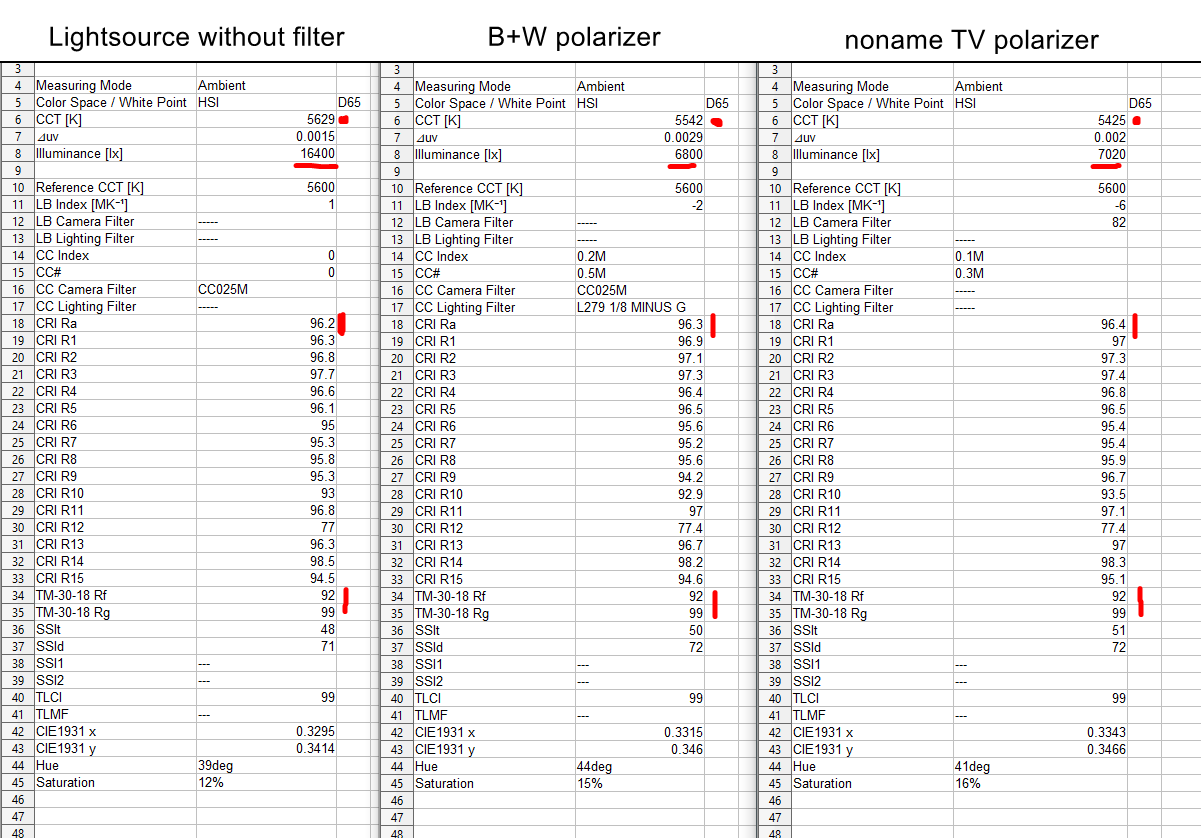
Spectrometer measurements of polarizer sheets
They are generally a bit warmer in color temperature than the brand product, but that's a non-issue since we need to white-balance anyways. Both the light and the lens filter will shift the white balance in some way. The important point is that the light quality hasn't been affected. Both the CRI and TM-30 levels haven't changed.
For the lens filter, I'd personally go with the most high-quality one you can afford. The color shift is less of an issue but you really want the highest transmission you can get. Cheap filters will block more light, good filters will make better use of your light sources.
Here are some comparisions that may be a good idea to read before buying a circular polarizer:
"My Not Nearly Complete, But Rather Entertaining, Circular Polarizer Filter Article"
"My Last Circular Polarizer Post"
Linearizing a photo & black point shenanigans
After shooting the cross-polarized images we need to make sure there's no tone-mapping, no curves, no fancy lut, nothing on the image that could skew the linear response of the sensor to the light. What we want is the most boring and technically correct version of reality we can get. Just like reddit, but in reverse. We don't want a pretty picture we want 20, 30 million measurements in form of pixels.
For the same reason we apply tone-mapping to our renderings - namely to make them look like photos - we need to negate the tone-mapping that is already on the photo to make them usable as a shader input. Pretty much all the raw converters on the market apply an S-curve type tone-mapping to the images by default.
We need to make absolutely sure this doesn't happen with our photos. Different raw converters have different methods and options to disable this. Lightroom for example doesn't provide any way at all to do this internally, so you need an external program to linearize your files (thanks Adobe!). RawTherapee on the other hand seems to be able to turn off the curve just fine, but unfortunately can't read my lossless compressed Sony raws.
Another issue to be aware of is determining the raw converter's view on black point compensation. In a perfect world, the camera itself will determine what it considers to be "black". The point where no photons are reaching the sensor and the read noise isn't a factor. In modern cameras that is done in the analog stage of the image capturing. The camera will figure out what the "unlit" state of the sensor pixels is (as a gross simplification: the image sensor pixels act like little capacitors, and a special component will determine the "off state" voltage of said capacitors and thus set the black point accordingly).
In reality, raw converters again have different points of view on what they think the users want. From the lumariver manuals (black point subtraction, more on that later) it appears that Lightroom presets add their own black point compensation on top, trying to guess what the darkest part of the image should be and compensate levels accordingly. This may be ok for regular photos but it's definitely not great for us since we want linear data and cannot compensate for a random thing Adobe does behind closed doors. RawTherapee has settings for that and it appears that there is no hidden "make it nice" thing going on underneath (but don't quote me on that).
So, how bad is it, and do we need to be concerned about it? Well... yes... kinda... in Lightroom? Definitely. It is a visible effect and it's important to be aware that it's there. It is the one thing where the choice of raw converter appears to matter. I haven't tried out Capture One or Darktable, so I can't comment on those. In terms of RawTherapee and Lightroom, however, there are things you can do, which we will discuss in the next sections.
Difference in black point
Left is without Adobes black point compensation, right is with it active. Quite a bit of a problem, mostly in the blacks of course, but this is where the difference of properly calibrated Basecolor textures really translates into the final rendering.
Making a linear profile for Lightroom
Creating a profile for Lightroom is not quite straightforward. There are several options, and each has pros and cons.
The easiest way to do it is to download the "DNG Profile Editor" by Adobe from 2012. You can specify an existing base profile (like the Sony ST standard), tell it to switch to a linear curve, and optionally even make use of a color checker chart to pull the color matrix corrections from. However, you cannot change the black point subtraction and the matrices are using the pre-2014 color checker formula (which are outdated). However, if all you want is to just change a base profile to linear, that's a valid choice - you will still have the black point issue though.
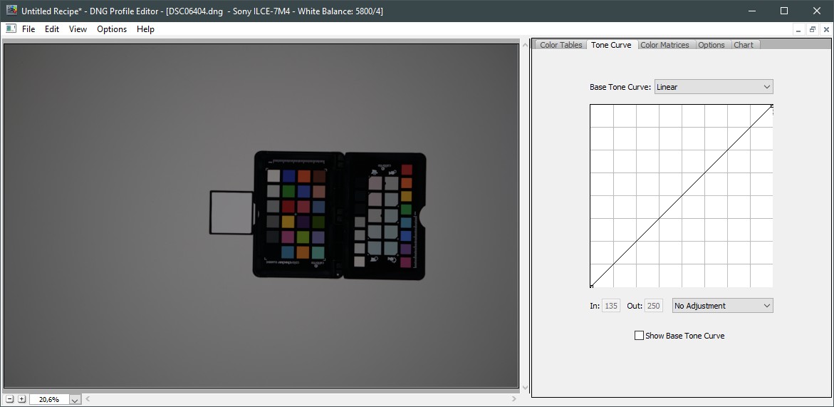
Adobe DNG Profile Editor
[UPDATE 2023/08/15]
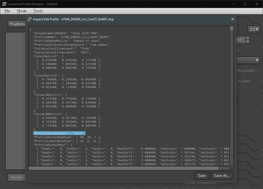
It turns out you CAN actually disable the black point compensation with a bit of manual work and the Lumariver Profile Designer as seen a bit further below. Thanks goes to Anders Torger from Lumariver for the pointer!
After exporting the Profile from the "DNG Profile Editor", you can open it in "Lumariver Profile Designer" under Tools - "Inspect/Edit Profile". There, you want to add the highlighted line to disable the Automatic Black Point Compensation:
"DefaultBlackRender": "None",
Save the profile again and that should be it. There are probably other tools that can open the dcp profiles but since I already have Lumariver, that's what I use. You may have to look around a bit for alternatives. After that, we should have a linear profile without tonemapping, without black point subtraction, and the standard color matrix from the existing profile.
Disable the black point compensation
My preferred app of choice is the Lumariver Profile Designer lumariver.com. It's incredibly powerful and you can pretty much change and specify anything you could possibly want, up to the color of the US president's knickers. There are three different versions with different sets of functionalities. The cheapest one is 30€, going up to 200€ for the full Repro edition. The cheapest one is enough to create the profiles we use in Lightroom. There's also a commandline-only version that is free, but that's beyond the scope of this article.
As with the Adobe app, you can load a DNG with a color checker for the color matrix adjustments.
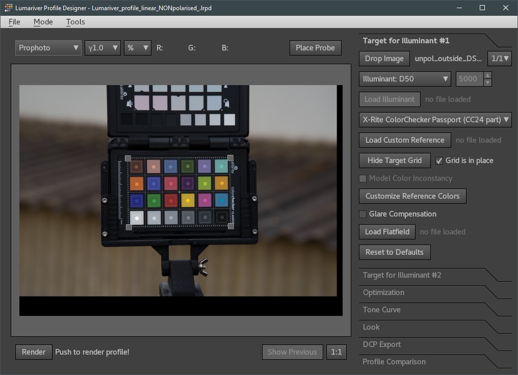
Lumariver Profile Editor
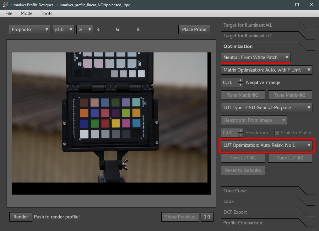
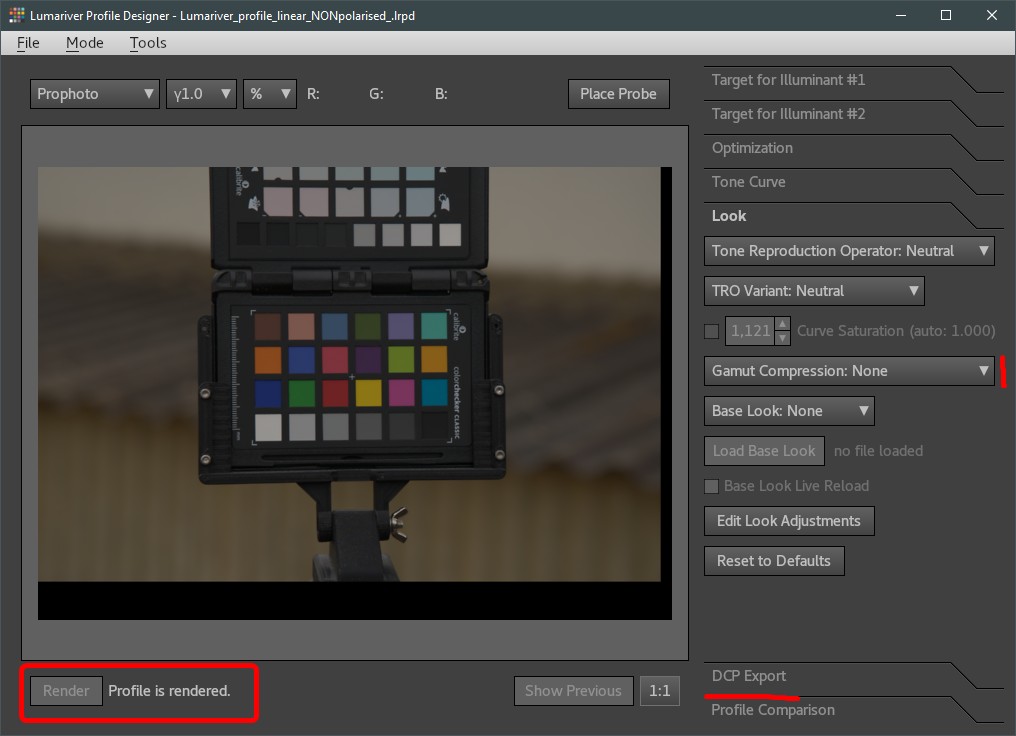
In the Optimization tab, we probably want to set it to white balance properly. Lumariver will choose the best suitable patch as a neutral, which in this case is the second brightest grayscale field. Another potentially important setting is the Lut optimization drop-down. The "No L" refers to Lightness in this case, and since it's highly dependent on how you shoot the color checker, it's probably not wise to take lightness into account for the matrix magic - especially if you shoot cross-polarized. https://www.lumariver.com/lrpd-manual/#lut_opt_selection
Lumariver Profile Editor
Next, we change the tone curve to linear and disable 'Automatic Black Subtraction'. These are the most important bits.

Lumariver Profile Editor
Since we already disabled tone-mapping, changing the look settings should not do anything(?), but it won't hurt setting them to neutral as well. Gamut compression may be useful for certain high-saturation corner cases, but I honestly haven't had any issues with it, so I just leave it off. After that, you just press render and export the profile to wherever your Lightroom wants to load them from ( in my case: C:\ProgramData\Adobe\CameraRaw\CameraProfiles )
Lumariver Profile Editor
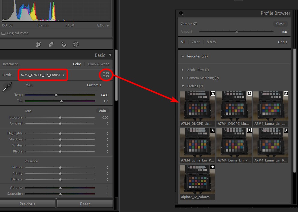
After a restart of Lightroom you'll find your newly created profile in the profile browser (you may want to put it in favorites for easier access)
Lightroom Profile Browser
The big problem with Lumariver is that you cannot reuse an existing profile. You MUST provide an image with a color checker to create the illuminant target. This doesn't sound like an issue but we will discuss this in detail after the next chapter.
Using RawTherapee for linearization
I've only discovered this application a few days ago, but linearizing images in RawTherapee is extremely easy... at least once you got your images loaded into it. It doesn't read my lossless compressed sony .arw, so I have to convert them to .dng first. After the one-hour rant - that you will undoubtedly have about the GUI and interaction scheme - it really is just one click.
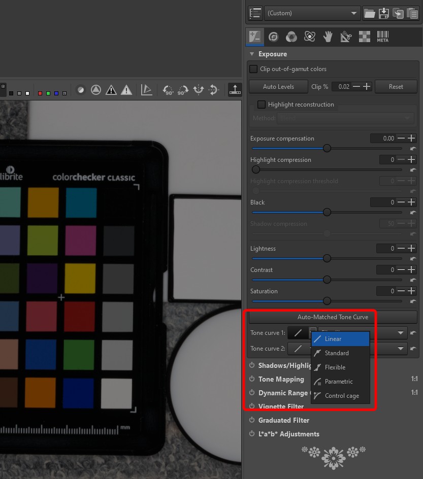
RawTherapee Linear Curve
Yes, it can be that simple. There are also quite useful color management settings in the 'Color' tab and I would highly recommend checking them out. Make some notes, Adobe! It's especially useful for picking colors and displaying linear values, but we will get to that a bit later.
In terms of black point subtraction it seems(?) to not be doing any additionally by itself, but please correct me if I overlooked it.
Can you trust Color Checkers?
Now, with properly linearized images, we need to make sure we get the exposure and the colors adjusted correctly... and what could be better for that than a Calibrate Color Checker... right?

Silly image
First, let's review what we know about the color checker properties. The stuff we're interested in is the Macbeth-style page with 18 different colors and 6 (more or less) grayscale color patches. We can look up what these patches are supposed to be - with tables providing values in Lab D50, or sRGB, or whatever you like really. What we have is a photo of those patches and what they are supposed to be. What more could we possibly want than that?
Unfortunately we're running into the same issue as we were having right at the beginning: what are these colors ACTUALLY representing? They are reflectance spectra, and those reflectance spectra include both diffuse AND specular reflection - which means we are trying to correct a diffuse-only photo with calibration targets that are diffuse AND specular. In practice this means that we are correcting our more saturated and overall darker, more punchy colors, to look like the ones that have specular reflections on them, so less saturated, brighter, and milky.
Unfortunately, there is no data for the diffuse only contribution of these charts and Calibrite doesn't seem to be very keen on publishing them either - which, in fairness - is understandable for practical reasons.
So, what do we do about it, and what is the color checker consequently useful for? The only thing we can trust, and would therefore be useful to us, is the hue of the targets (and even that is relative, see the link below). We can't use the brightness, we can't use the saturation. We're at a point where we have to discard most of the color checker data. What's left is hues from 18 colors that were shot with light of (probably) unknown spectral distribution.
Why do we want to use a color checker in the first place? Probably because we don't trust our camera or rather the manufacturer to have configured, tested, calibrated, and set up the spectral response of the sensor properly - and yet we think those 18 colors that we can only use the hue of will make that significantly more accurate.
I think you get the point. Color checkers are useful in certain situations, but if they are really useful in OUR case is up for debate. There are a few interesting articles about this that are worth linking here:
- The colorchecker considered mostly harmless
- Exploring the limits of color accuracy in technical photography
In the end, it's up to you if you want to use color checkers or not. As for me, I decided to trust the camera manufacturer and their multi-million dollar equipment to be overall more accurate than I trust myself holding up a color checker the right way and then somehow calibrating it with values that are dependent on many environmental factors. Provided I use a neutral development profile of course. If I were to use a vivid or portrait profile, well... can't expect accuracy there.
If you don't trust the camera or raw converter profile and don't know how good your light source spectrum is then shooting the checker in overcast daylight and without polarisation is maybe the most "correct" and comparatively useful way to test it ... maybe! If you can't see a significant difference - more than what uneven lighting or the randomness of specular reflections can cause - then what's the point in doing it in the first place.
Unfortunately, as we've seen in the chapter about creating a profile for Lightroom... you don't have a lot of choices with this particular app (thanks again, Adobe!). If you want to disable black point subtraction - and you do - you need to use Lumariver, and with Lumariver, you have to use a color checker. Damned if you do and damned if you don't. I still think a daylight lit unpolarized color checker is the best option there but I don't like it. For this reason, I will probably use RawTherapee going forward, at least for this kind of work.
Long story short: Even if Sony, Nikon, or Canon are having slight variances in their mapping from spectra to digital color, it's probably still more trustworthy overall than using a color checker in a way it wasn't designed for. Personally, I think selecting the right neutral base profile is much more crucial. Making sure it's proper linear, AND using a good quality light source will be much more important than the color checker could possibly be. But, as I said before, it's an opinion - it's up for debate.
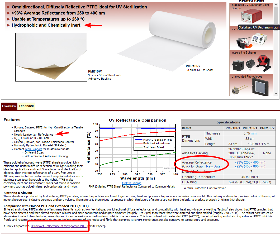
Finding a low-cost exposure calibration target
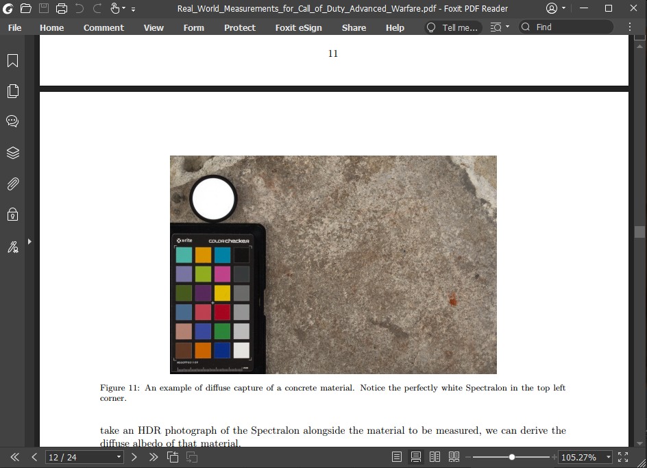
If you read the previous blog post about this topic you might remember the Activision Paper about their work on PBR materials and scanning. In this article, you can see that they use Spectralon as a 100% reflective white target.
Spectralon 100% target
Spectralon is sintered PTFE and one of its primary advantages is that it's a reasonably good Lambertian surface, meaning it reflects light equally into all directions. Besides that, 99% of the incoming light is reflected again - perfect for a calibration target. Unfortunately, with 500 €/$ for one it's also not exactly cheap, but if your budget allows for it - that's what to choose.
As with any other material, Spectralon also has a certain percentage of specular reflectance. At nearly 100% total reflectance though, the error you get by ignoring it is probably somewhere around 2.3% (based on an assumed IOR of 1.36 as with regular PTFE). Meaning, when looking at a 50% grey color patch that error has already dropped to 1% and for me at least, that's well within what we could possibly hope to achieve with a consumer camera and setup anyways. If that feels a bit dirty, you can of course calibrate to 98% instead.
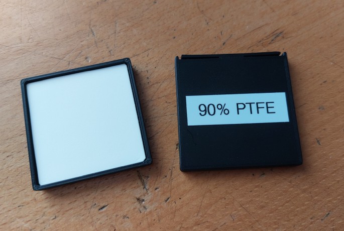
Sadly, my budget does not allow for Spectralon targets, so I had to come up with an alternative that is equally trustworthy, cheaper and ideally has the same surface properties. Lacking spectralon as a reference surface, the only way I could trust another material was with very detailed spectral data from a manufacturer or lab. So basically anything that can differ in manufacturing wouldn't work out. Plastics like PVC or similar may appear white but aren't all the same to begin with, they differ greatly in color, and will react to UV light and thus change their properties over time.
With Spectralon being sintered PTFE, the logical conclusion was to try out basic industrial PTFE (or Teflon). It's chemically inert, doesn't react to UV light, and is mostly made the same way everywhere. The issue, however, is that it doesn't quite behave the same as Spectralon, it's visibly transmissive and the density and manufacturing can change how transmissive it is. The surface also behaves like regular shiny plastics. To make it more uniform it's necessary to sand it and... hope for the best.
I bought a block and a rod of PTFE and tried out different thicknesses and their response. The flat PTFE block was very even in density and transmission, the slices I cut off the rod however show some interesting behavior that I presume comes from the extrusion process. In the image below you can see it's not even the same if you flip it around, which maybe hints at some anisotropic properties?
Slices of PTFE
In terms of spectral response, it's also somewhat unclear how much light it actually reflects. Again it depends on the thickness, and spectral data in papers for industrial PTFE are varying. You could of course calibrate it with spectralon as a reference but that's the chicken and egg problem all over again as it is with any other material really.
While looking for PTFE spectral data, I stumbled upon a lab supplier that sells thin 0.75 mm sintered PTFE sheets https://www.thorlabs.com/newgrouppage9.cfm?objectgroup_id=13871 . These sheets have basically the same surface properties as Spectralon but aren't quite as reflective. More importantly though, they come with measurements for total reflection and transmission. Combined with the IOR of PTFE it's good enough to determine pretty much exactly how much diffuse reflection there is. Jackpot!
Thorlabs Website
Transmission Specs
Having learned from the color checker mess, I wanted to confirm that the manufacturer specifications add up. I made some transmission measurements and compared them to the provided data.
Using both a spectrometer and a regular light meter, I made sure the transmission was as stated (somewhere around 6-7% according to my measurements). With that 6-7% transmission, a total reflectivity of around 92%, subtracting the 1.36 IOR of PTFE (equivalent to 2.3% specular reflection) the resulting diffuse albedo turned out to be around 90%. Even including potential measurement errors on my side, that's pretty much spot on.
To make sure we don't accidentally skew our results by screwing our transmission via backscattering, a black backing is advisable. This will absorb virtually all light that gets through and would otherwise reflect back and thus mess with our measurements.
The final calibration target
Interestingly, I tried using this to calibrate regular PTFE, and it turns out that they have just about similar reflectance levels. I would go with at least 10mm of thickness and only measure from the middle bit, but in a pinch, that may be good enough.
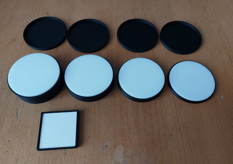
PTFE Slices
An early comparison of different test surfaces
Setting the exposure and white balance
The easiest way to do the exposure adjustment is, of course, to use the exposure slider in your raw converter of choice. Different raw converters, however, display color picker values differently. Most will not show you the LINEAR color but the gamma-corrected one - you have to make sure to adjust for that. If you are aiming for a 90% diffuse albedo you will have to set the exposure to a level where the reference patch is at 0.9 rgb linear. For gamma-corrected views and color pickers, you MUST also gamma-correct the target value you're aiming for.
Personally, I like to confirm everything I do in Blackmagic Fusion. It doesn't do anything unexpected under the hood and I can choose to work in whatever color space or gamma level I like.
As for Lightroom, I generally don't really trust it and I can't be sure it does what it says it does. There's supposedly some unknown level of highlight roll-off going on in the later development engine versions. It appears, however, that the color picking shows the color value in the display color space including gamma correction (so, for most people that would probably be sRGB 2.2).
RawThereapee, in contrast, is pretty versatile in that regard. You can use multiple color pickers AND let them display the linear color value.

Linear Color Picking
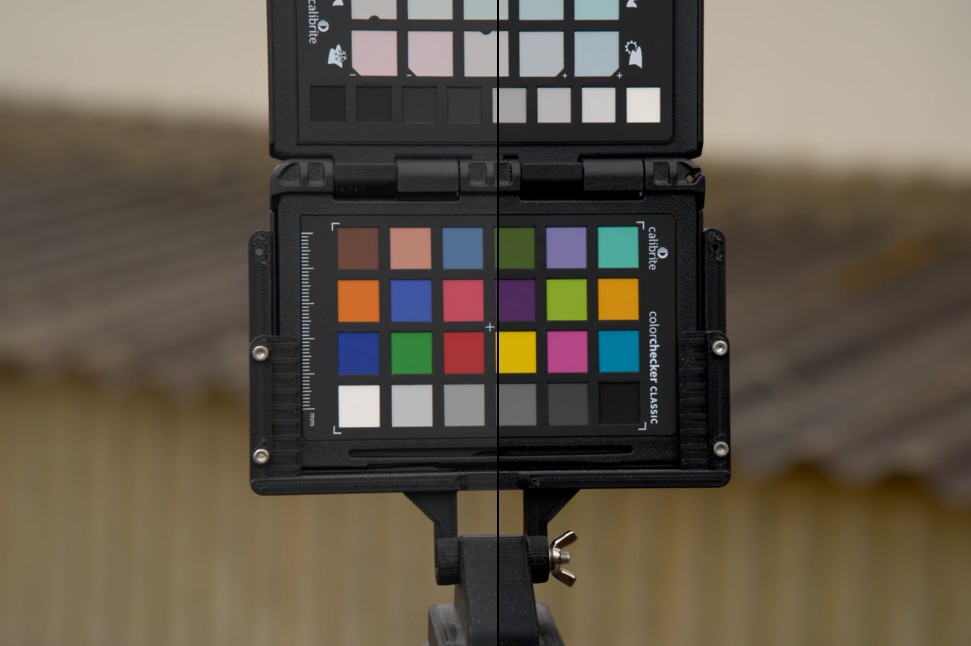
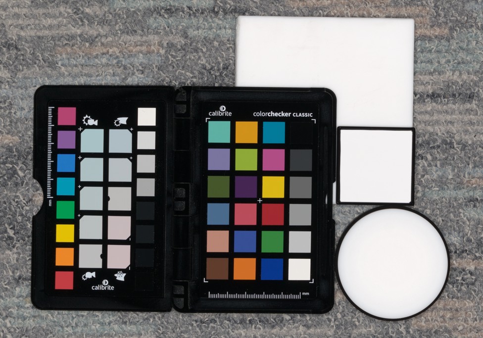
Now, what should we choose as a white balance target? Is the color checker white balance page the right choice? Is a grayscale color field good enough and if so which one? Do we even still need the color checker in our images? Would the PTFE target not do just as well?
I don't know. As you can see in the image above, the PTFE target and color checker white balance disagree with each other quite a bit. In this case, I used the 51.8% gray patch on the color checker to do the white-balance, which seems to be the recommended one. I don't feel like the white balance from the color checker is actually neutral when cross-polarized; it feels slightly warm, but that's of course entirely subjective. What I have noticed though is that the color shifts slightly when I change the polarisation angle of the light filter, so that's a bit fishy.
As with the colors, it is most likely that Calibrite expects the checker to be used with specular reflections. So are we skewing the neutral target by cross-polarizing?
One data point of course isn't enough. I also used a different white balance gray card from Novoflex, again with quite different results. I didn't go too deep into the rabbit hole (yet) but I presume there are probably different ways to calibrate to different illuminants and intended use cases.
So, to summarize, I can't say what a proper neutral target is. In the end, without trustworthy data, you have to pick one and stick with it. I would love to get some input on that from someone who actually knows what they are doing.
Whatever you choose as your white balance source... you can of course use that to define a new PTFE color target, like in my case above where it would be 90.2% Red, 87.8% Green, and 88.2% Blue. The downside is that it's a lot harder to aim for in a raw converter. Generally, I would highly recommend to blur the image slightly (or choose a larger picker) before picking values , so you get rid of any slight color variation from noise or dirt. After that, you only really need to bring your PTFE target to the shoot.
The proof is in the pudding. Providing evidence.
So far, this whole article has been about how to do things differently to what someone else said how to do it. None of this is any better than any other method without providing some evidence. If we want to improve the methodology we also need to make sure there's proof. Fortunately, there's a great way to check and verify that what we have done here isn't complete nonsense.
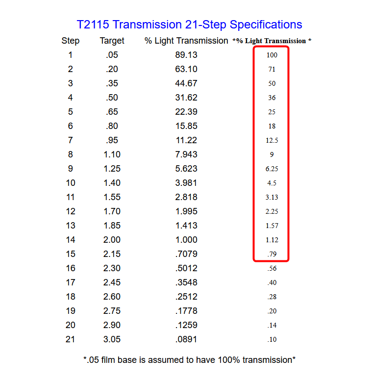
We can test the linearity of our profile using a Stouffer transmission step wedge https://www.stouffer.net/TransPage.htm . That's a transparent strip of plastic you put on a self-illuminating surface that has increasingly dense patches of light-blocking material on it. The manufacturer provides exact data for how much light each of these steps is transmitting. The great thing about this is that cross-polarization doesn't matter. It doesn't matter if we're splitting specular from diffuse or not, transmission is always transmission, there's either the right amount of light coming through or there's not.
I got the 21-Step version https://www.stouffer.net/T2115spec.htm because that's what was in stock at the time, but it doesn't matter what you use, as long as it has a broad enough spectrum to make a judgement.
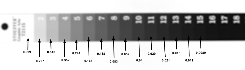
Now we shoot an image of said step wedge on something like an OLED phone screen or tablet, anything really that is sufficiently even lit. I would avoid LCDs, but it should do as well. Even a piece of paper over a bright light source might do in a pinch. We don't need lab-grade accuracy, just an indication if what we have done is good enough.

Linearized shot
Manufacturer specs for reference
If those samples reasonably match what the manufacturer provides as a reference, then we know we have in fact a proper profile to put our trust in. As you can see in the example above, there are slight variations. However, note how small those variations really are. There are lots of things in the setup that can affect the result. All I did was put my phone on the floor, opened a white picture, and shot it with my camera. No polarisation, no perfectly dark room, and yet we're pretty close to where we were aiming for.
Edit 2023/07/28: I noticed that the color picker values in the RawTherapee screenshot above are crudely rounded (and/or taken from a lower bit depth buffer). It doesn't change anything in the results or the point I'm trying to make, but for completeness sake, here's the same shot with more precise values picked inside BM Fusion. Fusion Picked Values
Here's the same picture but a with a non-linearized profile that's using a conservative s-curve tone mapping.
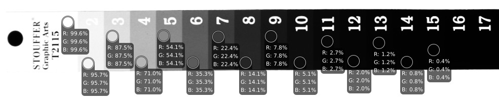
Non-linear shot
I hope this demonstrates the immense value that this comparatively cheap step wedge can provide. With this small piece of plastic, we can both validate that our profile is in fact linear and furthermore have a good indication that the black point is probably fine as well - at least to what we can reasonably measure. It will definitely be enough to prove that a piece of black plastic we shot is not in fact at a 4% diffuse albedo level.
If you already own a color checker, you can also use that as a "rough" quick check if your profile is at least reasonable. Make a crop of the 6 grayscale color fields and display a waveform, you will notice that the gamma-corrected version (not the linear one!) will give you somewhat of a straight line. Too straight to be a coincidence, and thus it's probably fair to assume it's by design. Let's use it to test if our camera profile is (visually) linear.
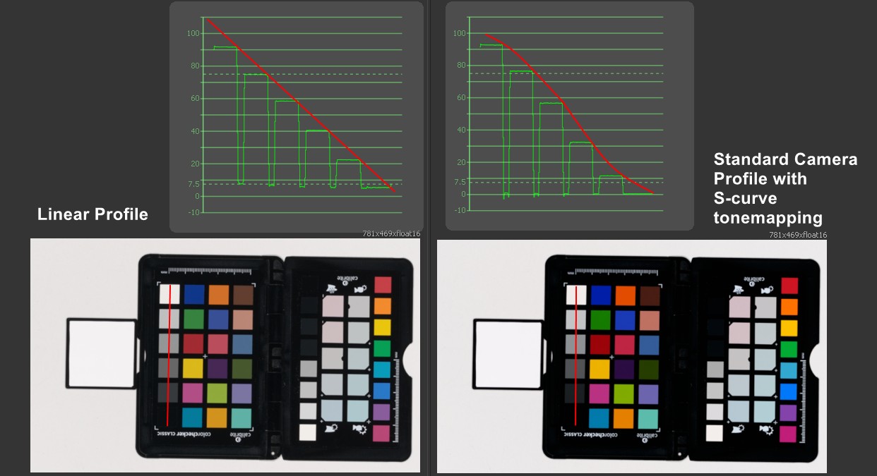
Color Checker Waveform test
The left side is a linearized profile, and the right side is the standard profile from the camera manufacturer ("linearized" referring to the camera profile, not the image gamma curve!). We can clearly see the S-curve type tone mapping of the standard camera profile coming through. This is only anecdotal evidence of course and is way too imprecise to be useful, but I found it a nice visual gimmicky way to show what's happening in the profiles.
Conclusion
First of all, sorry to anyone who facepalmed at something I did completely wrong. Please get in Contact ! This blog post is not about me wanting to be right, it's about making some progress towards a better more concise, and evidence-based workflow to capture and/or edit textures for CGI. If there's something wrong, I definitely want to correct it. I'm sharing all of this so we can hopefully leave the questionable PBR validators and rules behind and get more consistent and higher-quality assets in and out of the industry.
This article is a very condensed version of what I've been doing, trying, and testing out over the past weeks, months, and in some sense years. I tried to make this short (no, seriously) and there are still things I did not include here. All of this looks simple and straightforward in hindsight but it definitely wasn't when I started. It all took much longer to figure out than I hoped it would.
Thanks for reading! ... Yeah I know it was too long.