Albedo and its effect on photorealism
The concept
Albedo (/ælˈbiːdoʊ/) (Latin: albedo, meaning 'whiteness') is the measure of the diffuse reflection of solar radiation out of the total solar radiation received by an astronomical body (e.g. a planet like Earth). It is dimensionless and measured on a scale from 0 (corresponding to a black body that absorbs all incident radiation) to 1 (corresponding to a body that reflects all incident radiation).
Basically, albedo is the percentage of light a body reflects. 0 percent means the object absorbs all light, 100 percent means that the object reflects every bit of light. The minima and maxima of this spectrum are not achieved by any typically occurring materials on earth. The usual spectrum is somewhere between fresh snow (0.9) and charcoal (0.04), so between 4 and 90 percent.
However, it is important to note that these Albedo reference values are usually containing both diffuse AND reflection. So, despite some PBR guides claiming that the Basecolor should never go below 4%, this is not correct. The Basecolor value can go way lower than that while the 4% the guides refer to is actually the specular reflection part of the material.
If you want to know more, here's a blog post I made about this exact issue: PBR - From Rules to Measurements
... and the follow-up article with physical proof and methodology to do it yourself:
PBR - Shooting and Calibrating Basecolor Textures
Why it matters
It's important to understand that the colors we see are highly subjective and humans are incapable of giving even remotely realistic estimations of the percentage of green, blue or red an object reflects. This is due to the fact that the eye is adapting to the lighting around us, basically exposure and white balance. We also don't see the world in a linear fashion. Our brain compresses brightness into more of a logarithmic curve that we perceive as natural (meaning: what we think is twice as bright is actually a lot brighter).
All of this means that we are inherently bad at guessing colors which often manifests in unrealistic renderings. We need to define materials in terms of which fraction of light that material reflects or absorbs. This property is always the same, no matter how bright or dark or bluishly lit our environment is. We can't use what we perceive as a "bright" or "dark" material. The interior of a house looks a lot darker when viewed from the outside at a sunny day than in the middle of the night.
Let's look at a few examples of a room where everything is supposed to have a typical "white wall paint" material. We will try out different albedos and adjust the exposure to compensate for the resulting brightness of the image. All images have been tone mapped the same way.
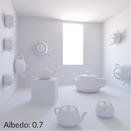
albedo of 70%
Albedo of 0.7, or 70%. This is what is generally considered a "safe" value for white walls (8bit rgb of 180 180 180) The material reflects 70% of the light it receives. So each time a photon bounces off of the surface it will lose 30% of its energy. We can see moderate shadows and the scene looks and feels like what we expect a white room to look like.
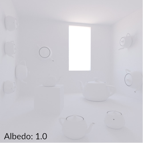
albedo of 100%
Now it gets interesting. This is what our scene looks like with a material that reflects 100% of the incoming light or what we would call a "white" material. Each photon will be reflected with 100% of the energy it had when it reached the object, basically bouncing around forever, never losing any brightness. The only reason why our render engine is able to complete the rendering is that the amount of bounces is capped at some level.
We can also see that there are basically no shadows, everything looks washed out and flat. Unfortunately, some artists still use materials with such an albedo ( 8bit rgb of 255 255 255) believing that this is what a "white" material looks like.
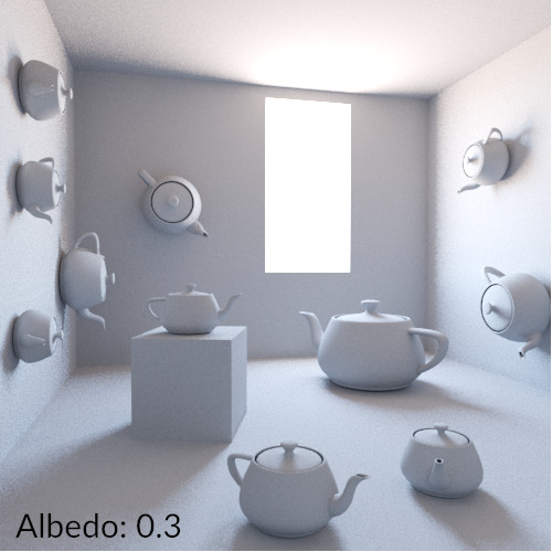
albedo of 30%
So let's go in the other direction. An albedo of 0.3 or 30% means that photons lose 70% of their energy with each bounce. It looks "ok" but somehow much more artificial and "CG" than the first rendering. Shadows look a bit too dark and dirty.

albedo of 10%
An albedo of 0.1 or 10%. The rendering is horrible and looks like it was made in the early 2000s when linear workflow wasn't a thing yet. It's definitely not what we would call photorealistic. Yet all 4 images can be described as a "white room" proving that colors are highly subjective for us.
Saturated bright colors are achieved with tone mapping and color correction of the final image, not within the albedo!
We've only looked at the pure diffuse properties in this chapter but generally speaking: bright materials are often way darker than we assume. Dark materials have darker and more saturated Basecolors than we often expect since the reflections compensate for that and let the material look brighter.
A typical critique of using realistic Basecolors is that renderings may not look like what we expect (in relation to what the Basecolor looks like). Don't think of it as defining a color in an image but as defining the physical property of absortion in a material. These are completely different things.
Also keep in mind that all of this requires proper tonemapping and proper usage of light sources and their intensities. Reflections play a huge role as well. The darker the material, the more reflections define the overall look.