Tonemapping
Definition
Tonemapping is generally understood as compressing a high dynamic range image into a medium that has less dynamic range available. In terms of 3D rendering, this means compressing the realistic, almost unlimited brightness range into something that looks realistic on a screen or when printed on paper.
It is worth mentioning that there is also tonemapping in photography but it's usually used in a more "artistic" manner (if you prefer to call it that way). This is not what this article is about. The goal is to achieve a believable, photo-realistic output image.
The basics
First, we need to clarify a basic principle regarding rendering: linear images.
In computer graphics, especially in 3D rendering, calculations are performed in linear space. If you want to equally mix red and green you add both color values and divide it by two. If you want to know how bright a pixel in your scene is you add the effect of all light sources together. If you add 50% medium gray and 50% medium gray you will get 100% white. So if we create a gradient from black to white we expect to see a linear increase in brightness. For the rest of this chapter, we will assume that our renderer will output exactly that, a linear image. This, however, is not necessarily the case and behind the scenes, we actually need to gamma correct our linear images for display. Make sure you read the "linear workflow" chapter for more info on that. This article will not require knowledge about linear workflow but you should read it afterwards if you haven't done already. You will need it to understand how to import and export linear data and apply tonemapping in a 3rd party post-processing application (like Nuke or Fusion).
Many renderers support tonemapping in their framebuffer so you don't have to export the image and can use this tonemapping functionality for previewing purposes.
Enough of the technicalities, let's get started.
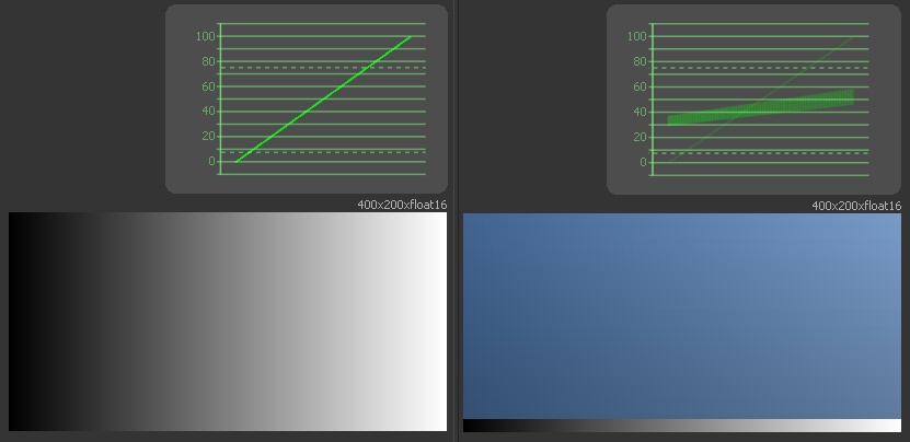
Examples for gradients with a waveform display
The little graph above the gradient on the left is called a waveform view. In our case, it displays the luminance or brightness of all the pixels in the image below. The x-axis, from left to right represents the image from left to right. The y-axis represents the brightness between black, 0, and white, 100. Each pixel of the image is drawn in the graph. In the case of the left gradient, it results in a straight line from the lower left to upper right because all pixels in each column have the same value. In the case of the right image, we can see that there are two separate shapes in the graph, the very faint line as we've seen before represents the thin black-to-white gradient on the very bottom of the image. The thicker blue part above contains a very soft gradient from top to bottom and a slightly stronger gradient from left to right. We may not be able to see the top-bottom gradient in the blue rectangle visually but the waveform makes it visible.
We can see in the waveform that our gradient is indeed linear. That's what our render is like by default. A light that is twice as bright as another will have double the RGB value in the image. So, what's the problem with that? The issue is that our eyes do not perceive the world in a linear fashion. Our eyes perceive brightness in a more logarithmic way. A light twice as bright doesn't look like that for us, it just looks "somewhat" brighter. The same happens with hearing, we don't perceive something that is twice as loud as actually being twice as loud - that's reflected in the decibel scale.
So you might then ask yourself why the photos of our digital (or even analog) cameras still look right. Well, they are not linear. Camera (and analog film) manufacturers do apply their own tonemapping, their own look, to the image to make it look like something we actually perceive as realistic. The medium we use to look at our photos, be it paper or monitors, can't reproduce the actual brightness of the things we captured with our cameras. The dynamic range of that medium is tiny in comparison. So to make it look right to us, we need to do what our eyes, or rather our brain, does for us in the real world. We need to modify the linear input and compress the very bright values into something that is within our mediums maxima of black and white.
First, let's check what our camera output would look like if we linearize the image, meaning we remove the curve that the manufacturer added.
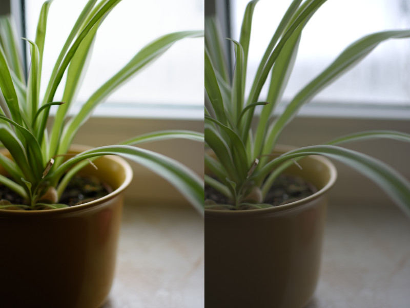
Left: Camera standard profile | Right: linearized image
On the left, we have our photo with the standard camera profile. On the right, we can see the same photo linearized. We notice that it looks flat and washed out. Our colors are way less saturated but we can also see more detail in the dark areas of our photo. All in all, we might assume that we can just add a bit of contrast and be done with it. Case closed.
Not quite. The interesting thing happens when we use a darker version of the image, where the window is not blown out.
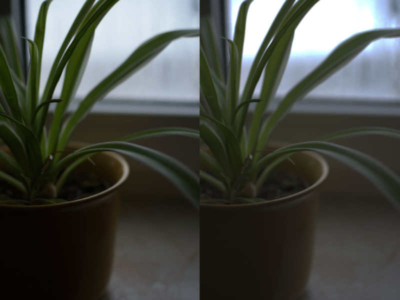
Left: Camera standard profile | Right: linearized image
Same setup as before but darker. Now we can see that our linear image has a very bright spot in the blurry region right at the top. We also notice that this isn't present in the original image on the left. Our linear image now looks quite odd, especially the saturated blue rim around the white blown out area is rather nasty, not what we see in real life at all. However, this is also what we see in our renderings, and this is the reason why we want to tonemap our renderings and not just use them as they are. Again, the linear image is technically a lot more valuable than the somehow post-processed image on the left but it's not what we want to show our client. We wouldn't accept a photo like this so why should we accept a rendering like that?
How to fix it
Let's get back to our gradient and waveform. To compress the highlights we need to flatten out the curve near the top. We want to compress all the colors that are near or even brighter than white into the black-white range we have.
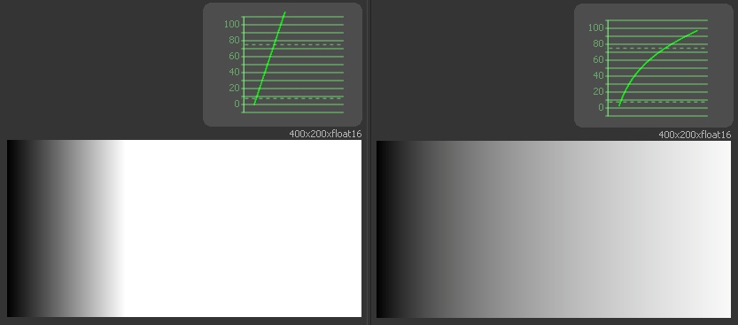
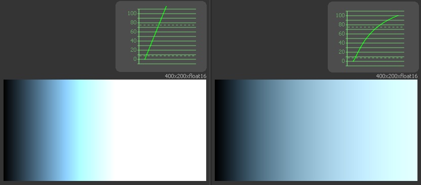
Left: linear gradient | Right: reinhard tonemapping
This time we use a gradient that has values between 0.0 and 3.0 (where 1.0 is white). So as you can see on the right, the reinhard tonemapping pushes the overbright areas back into the visible range. There are plenty of other tonemapping methods, all differ in some way or the other. Some have a little more contrast in the shadows, others prefer a more contrasty curve but the principle is the same. Let's look at a filmic curve as the last example.
Left: linear gradient | Right: filmic tonemapping
This time we're using a slightly bluish color in the gradient. It matches the situation we've seen in the photo example above, we see the same ugly blue border around the white blown out part. Our filmic tonemapping, however, handles this situation well and makes it a much more pleasant transition.
Conclusion
So let's look at an actual rendering to see what we can do with a very simple reinhard tonemapping directly in the framebuffer.
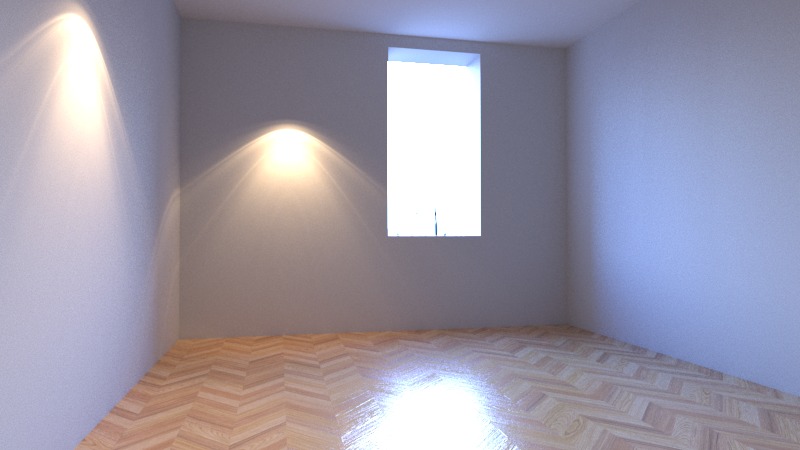
Linear rendering
This is our linear (not tonemapped) render as seen in the framebuffer. The lights are burned out, the room is slightly too dark and everything looks pretty artificial. Even the reflection on the floor looks awful.
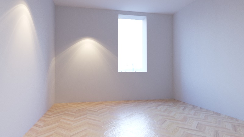
tonemapped rendering
Here we have the exact same rendering with tonemapping applied. The lights make sense, the floor looks plausible and the image overall is much closer to what we would expect to see in reality.
- Do not use linear renderings as the final output. If you do your tonemapping outside of your framebuffer, make sure you export and import it in a linear way. Do not use tonemapping on non-linear images!
- Do your lighting and shaders with tonemapping turned on (or a LUT if you prefer that). Don't make visual artistic decisions on a linear image.
- Burned out areas in a linear image are totally fine. Don't turn down light sources because they seem to be too bright in your image. You need to use proper, realistic light intensities for a realistic render! The tonemapping will take care of that. (Side note: glows and blurs also work a lot better on linear proper lit images. The tonemapping is applied afterwards.